| BY
ERIC BRACE
Washington Post Staff Writer
----------------------------------------
When Diana Quinn needed someone
to design a CD cover for the newest recording by her band, Honky
Tonk Confidential, there was never any question about
who would do it: "Dick Bangham's a genius,"
says Quinn unequivocally. "why wouldn't we use him if we
had the chance?"
-------------------- Nightwatch-----------------------
Richard Bangham is the most prolific designer of
record and CD art (and much else) the Washington area has ever
seen, creating the visual counterpoint to untold commercially
released recordings. "How many have I done?"
Bangham wonders aloud when asked to tally up his output. "Hmmm.
Let's see. It's hundreds. Definitely. But I've probably done more
than a thousand. I don't really know."
Bangham says he's pretty sure copies of everything
he's done reside in boxes throughout his Silver Spring home. but
he hasn't had time to organize and catalogue them. "If I
could find them all, it might be nice to display them all on a
wall or something," he says. "But we probably don't
have a big enough wall." This is said realistically, not
immodestly––words from a 52-year old man who "can't
remember a time I haven't been working on a cover for somebody."
He has created covers for some
of the biggest names in Washington music over the past few decades:
Mary Chapin Carpenter, Nils Lofgren, Chuck Brown, The
Nighthawks, Root Boy Slim. He and partner-fiancee Linda
Gibbon have also made the album artwork for national
acts like Little Feat, Black Uhuru, Mississippi John Hurt,
George Clinton and many more, but it's his Washington
portfolio that has made him such a beloved figure on the area
music scene.

"The
title of our record was going to be either 'Wine in a Can' or
'Your Trailer or Mine?,'" says Honky Tonk
Confidential's Quinn. "Dick said it had to be 'Your Trailer
or Mine?' because he had the perfect trailer to put on the cover,
and of course I just trusted him. Now people just stop and look
at the CD–really gaze at it–saying how beautiful it
looks. Sometimes they ask if what's on the inside is as good as
the cover!"
"That was one of those fun
ones," Bangham says. "Where you say to yourself, 'I've
got it!' and you know it's just right." The trailer on the
cover belongs to Bangham's brother, also a graphic designer, and
Bangham was just heading to California to help refurbish it when
Quinn called. "Linda and I would stay in the trailer in my
brother's yard when we visited him," Bangham says, "and
I was going out there to make it road-worthy and drive it up the
coastal highway. When Diana called with a list of possible titles,
I just said, 'Wow. I know exactly what it's going to be.'"
|
 PHOTO
BY SUSAN BIDDLE--THE WASHINGTON POST PHOTO
BY SUSAN BIDDLE--THE WASHINGTON POST
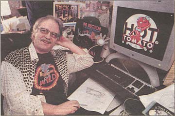
Album cover
artist Richard Bangham is up on the latest technology
but likes oldfangled methods. "I still prefer to
take a pencil out and get a piece of paper and just
start drawing ideas," he says.
|
Sometimes
things aren't so serendipitous, but Bangham likes the
process, the working through of ideas to find the one
that works perfectly. "Each record is so unique,
we really try to find something special that will match
the music," he says. "A lot of times, we're
asked to work something up before the recording is finished,
obviously, and so we'll get a rough mix of the music and
spend a lot of time listening to it, working while it's
playing, trying to bring out the personality of the music
and the artist in our artwork to find the thing that makes
each cover unique.
While Bangham has mastered the tools offered
by computer graphics software, when he starts on a project,
he gets very old-fashioned. "I still prefer to take
a pencil out and get a piece of paper and just start drawing
ideas," he says. "And I think something about
that way of working gives me an edge. I think it gives
my album covers a distinct quality, maybe a warmth of
some kind."
He did his first album cover work in 1969
when he designed the sleeve to a seven-inch piece of vinyl
released by his short-lived rock band Beverly Pureheart
(which included a young Joe Lee, who
now probably carries more Bangham covers in his music
store, Joe's Record Paradise, than any
other record seller on the planet).
That cover caught the eye of Adelphi
Records owner Gene Rosenthal,
who asked Bangham to come up with something for one of
his blues releases. "I just found that one!"
says Bangham happily. "I've got it right here. It's
called 'Things Have Changed: An Anthology of today's blues
From St. Louis.'" He names some little-known bluesmen
and says, "I did watercolor portraits of those guys
for the back cover, and the front was a pen-and-ink cartoony
thing of an old guy at the piano, another guy with a guitar,
very R. Crumb-looking."
Things snowballed from there, and in the late
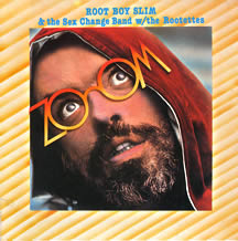
'70s he met up with root boy slim the rocker whose life
of excess made for surreal songs, over-the-top live shows
and a early death. "Root was amazing," Bangham
says. "when he found out I'd been doing some illustration
for The [Washington] Post, he asked me to take him down
to the newsroom and introduce him to everyone. 'You're
gonna help me get famous!' he said. I guess in a way I
did." |
|
Bangham became Slim's art director, designing his
trademark nutty glasses, posters, T-shirts, miscellaneous stage
props, and of course "puke bags." "His big song
was 'Boogie 'Til You Puke,' right?" asks Bangham. "So,
yeah, we had custom-designed puke bags."
Bangham even signed on as a Rootette, one of slim's
backup vocalists on a tour of England opening up for Ian Dury
& the Blockheads. "I knew all the dance moves so I
said I'd do it when they were looking for a replacement Rootette,"
Bangham says. "That might be my stupidest career move,
but I got to meet Peter Blake, who was Ian Dury's art teacher,
and quite a famous painter and collagist himself, and that was
amazing because he's one of my heroes."

When I don't make the right kind of appreciative
noises on the other end of the telephone, Bangham clarifies:
"Blake has done two album covers in his life, and one of
them is 'Sgt. Pepper.'"
Say no more.
(What's the other? Eric Clapton's "24 Nights.")
Getting back to his days as a Rootette, Bangham
retracts something he just said: "Wait, that wasn't a stupid
career move. Call it maybe a career detour, but not stupid.
Impuslive maybe, but I don't regret it."
Bangham's best-known work involves anothe prominent
album design, Neon Park, who made his mark
designing albums for Frank Zappa and Little Feat. In 1989, Bangham's
partner Gibbon began producing an unofficial Little Feat fanzine,
which eventually became the band's authorized fanzine. The relationship
developed to the point where Bangham and Gibbon were designing
posters and other items for the band, and also led to a friendship
with Park and his wife.
Aftern Park died in 1993, Bangham was asked to create
subsequent Little Feat covers using works from Park's archives.
(The Rhino Little Feat collection "Hotcakes and Outtakes"
is an example of Park's art augmented by Bangham's lettering,
cropping and design work.)
"I learned a lot from him before he died,"
says Bangham about Park. "He gave us alot of pointers,
and he kind of passed his palette to us when he went."
Washington artists like Mary Shaver, Flatfoot
Sam, Dave Sherman, Bill Holland, Uncle Chunky, Rare Essence
and Eddie Jones are lucky to have Bangham's
and Gibbon's palettes at their disposal to help et their music
noticed with striking designs.
"We've done boogie, blues, R&B, punk, country,
reggae, go-go, rockabilly. Maybe the only thing we haven't done
yet is a klezmer album!" Bangham say. "I like klezmer.
I hope some klezmer band calls me."
for more information on Bangham and Gibbon's design
work, go to www.ripbang.com.
|


